Checkmate 2022-2023
Checkmate Design System
Led the design and rollout of Checkmate's internal design system, supporting 3 product teams. Reduced UI inconsistencies and design debt by 80% in 2 months, and enabled faster, more predictable engineering handoff.
Role
Lead Product Designer
Team
1 Designer (me), 2 Engineers
Tools
Figma, GitHub, JSON

Core system tokens and components
Project Summary
I led the creation of Checkmate's internal design system during a period of rapid growth. My focus was on core UI foundations, reusable components, and clear documentation, working closely with engineers. The system enabled faster, more consistent development and gave teams a shared design language.
The Problem
Checkmate was scaling quickly, shipping new features across teams. But without a shared system, UI became fragmented, causing design debt and inconsistent user experiences.

Before: Inconsistent UI elements across teams
The Challenge
How might we create a unified design system that supports new features, speeds up dev handoff, and ensures a consistent user experience?
Blockers:
Inconsistent components and UI across products
No documentation or naming standards
Error-prone manual handoff from design to development

Fragmented components before the design system
My Role & Approach
Sole designer working directly with 3 engineers
Defined system foundations: color, type, spacing, elevation tokens
Built core components: inputs, modals, date pickers, navigation, buttons
Created Figma documentation for design-dev alignment
Worked with engineers to map Figma components to code
System Foundations & Components
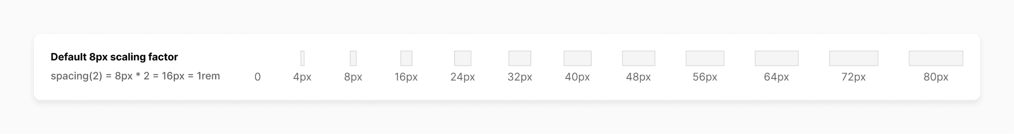
Consistent spacing scale

Typography styles for hierarchy

Semantic color tokens for clear states

Standardized layouts and navigation

Standard button and control styles

Unified inputs and form elements

Common controls: chips, tags, checkboxes, radios, progress bars, tooltips, and more

Clear feedback and alert styles

Lists and flows: selection lists, steppers, and accordions

Reusable date picker component

Pop-up dialogs for contextual actions

Live product using the design system (fictional data)
Results
Cut design debt by 80% in just 2 months
Dramatically improved UI consistency across products
Enabled faster design deliverables and feature launches
Accelerated design-to-dev handoff and reduced implementation errors
Made onboarding new designers quicker with clear documentation
Adopted by 3 product teams as the foundation for all new features